Helping Users Find, Start, and Prioritize: ChatGPT Improvements in Categorization, Project Visibility, and Search
Summary
A UX case study exploring the pain points behind ChatGPT’s endless scrolling chats and exploring how color-labeled projects, more visible features, and smart categorizing helped users need for clarity, continuity, and effortless organization.
My Role
UX Designer/ Researcher (Two Designers)
Duration
10 Weeks
Tools & Methods
Figma, FigJam
Desk Research
Interviews
Affinity Diagram
Persona
Competitor Analysis
Mentor
Background
ChatGPT made brainstorming easier — finding those ideas? Not so much.
We use ChatGPT every day to brainstorm and solve problems. But as our chats piled up, finding one idea from last week turned into endless scrolling. It felt ironic — this incredibly smart tool helping us think better, yet leaving us with a growing pile of messy conversations. That’s when we asked: are other users dealing with the same thing? And what if ChatGPT could organize chats as well as it generates ideas?
Secondary Research
I Know I Asked This Before... But Where?
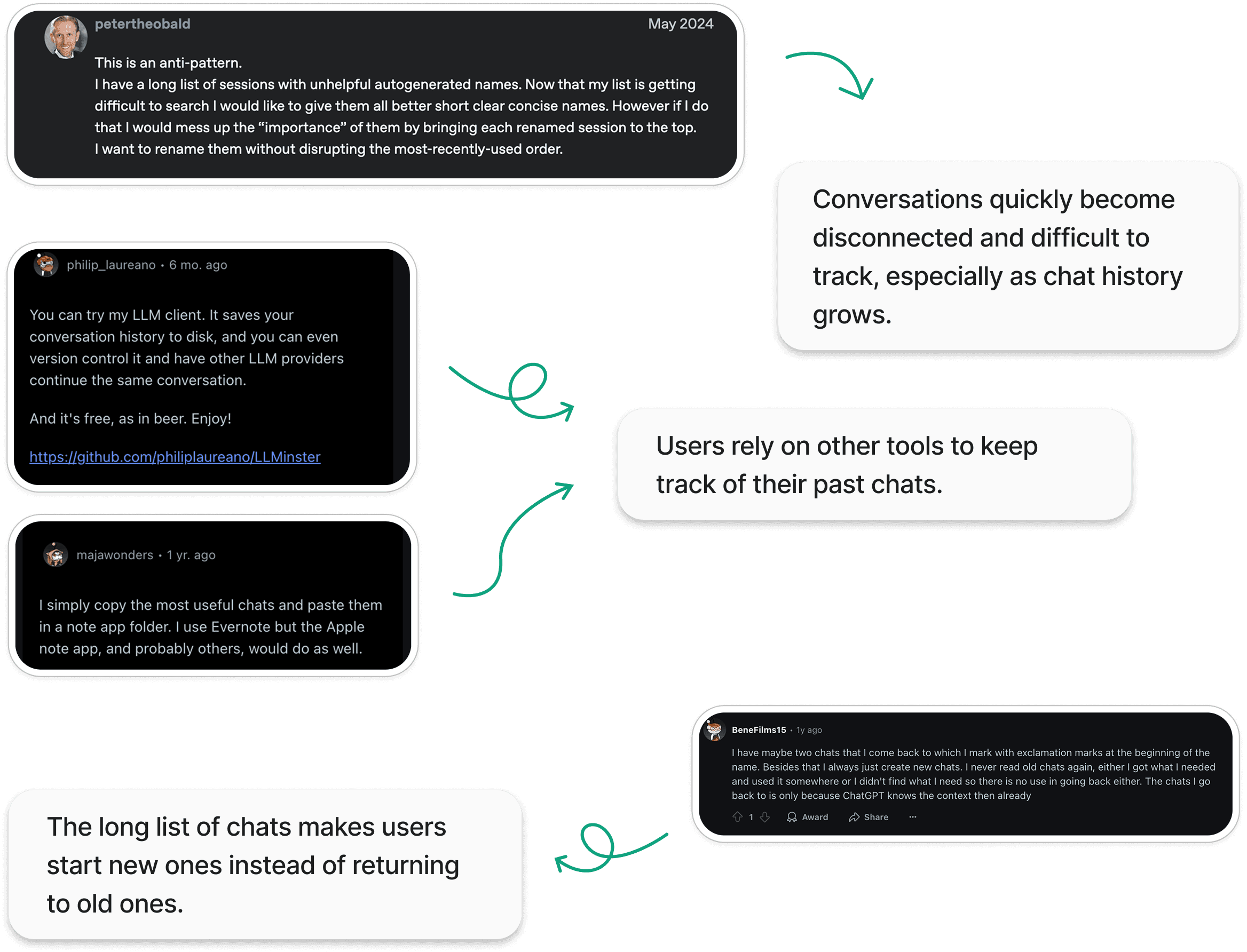
How users are making it work (for now)..
User study: a closer look at users' frustrations
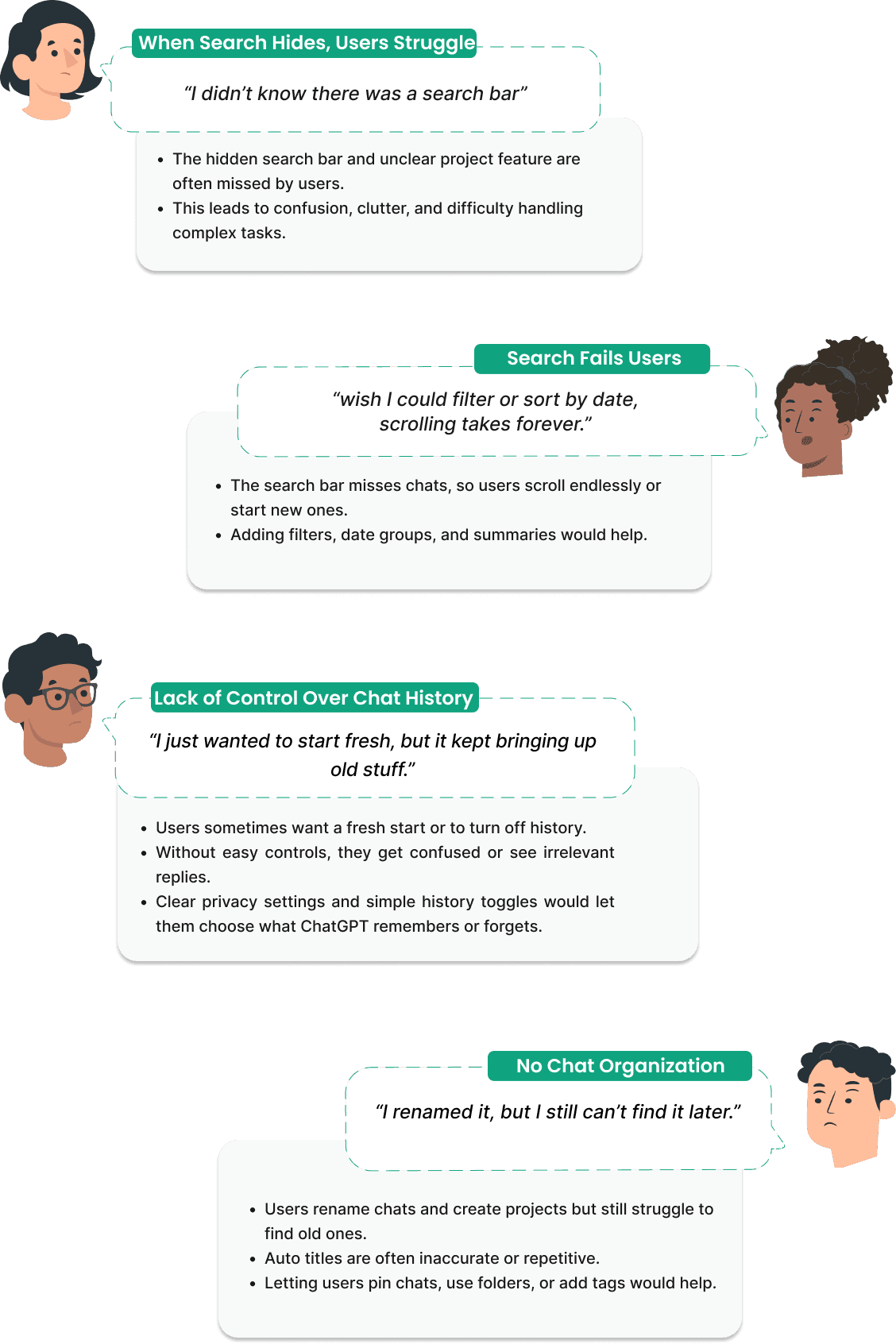
“I didn’t know there was a search bar”: Surfacing hidden features
We held nine online interviews to learn about users’ goals, habits, and challenges when using ChatGPT for personal and work tasks.
What we found?
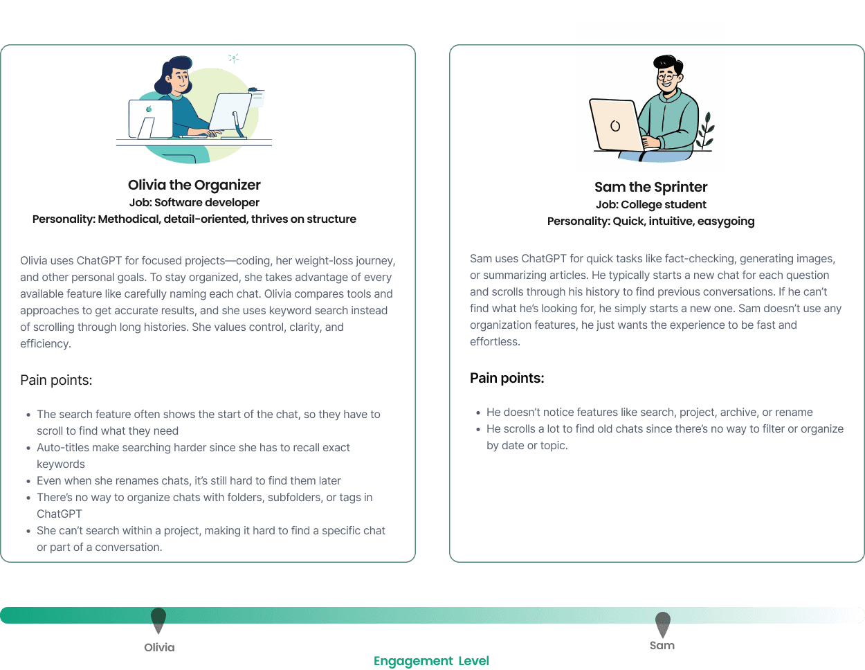
Who are our users?
Organized or Sprinter Users: ChatGPT's Chat Organization Design Problems Affect Everyone
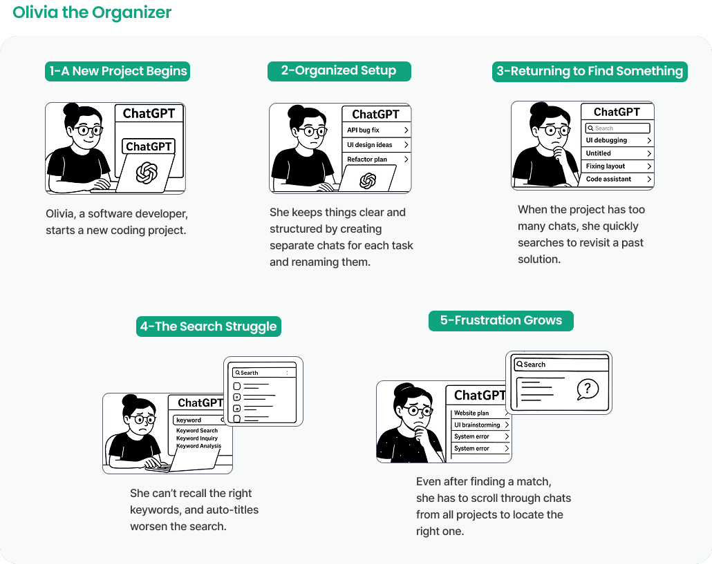
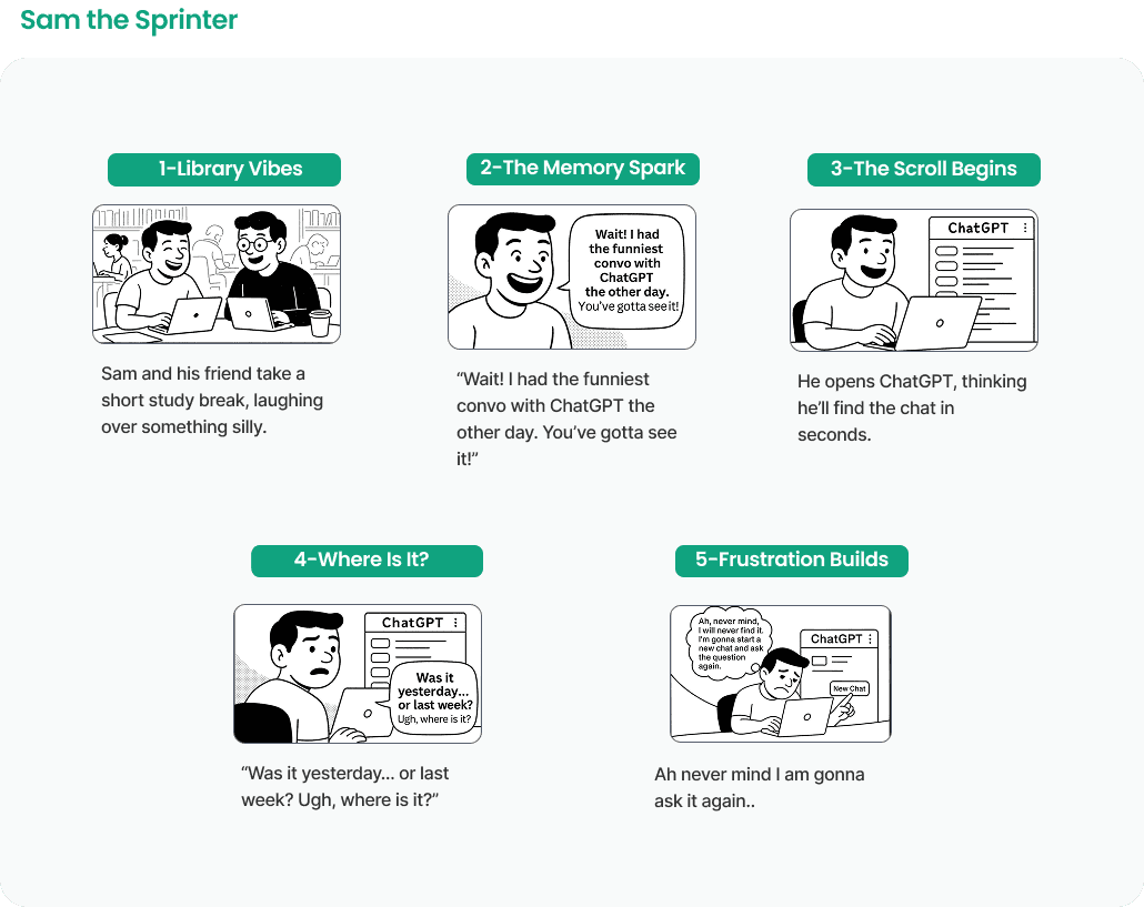
Story time..
Walking in our users’ Shoes: Why Both the Organized Planner and the Quick Sprinter End Up Lost in ChatGPT
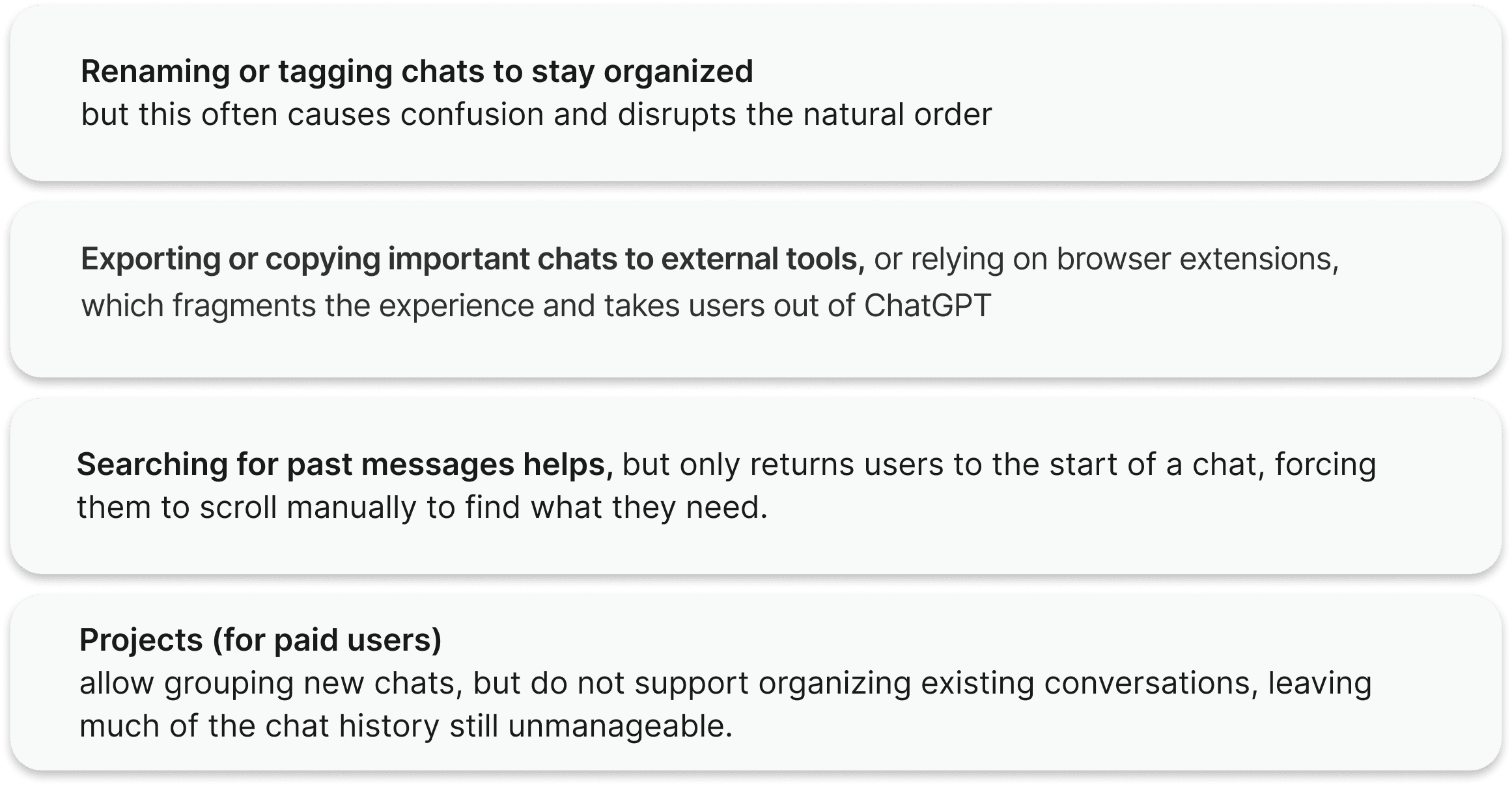
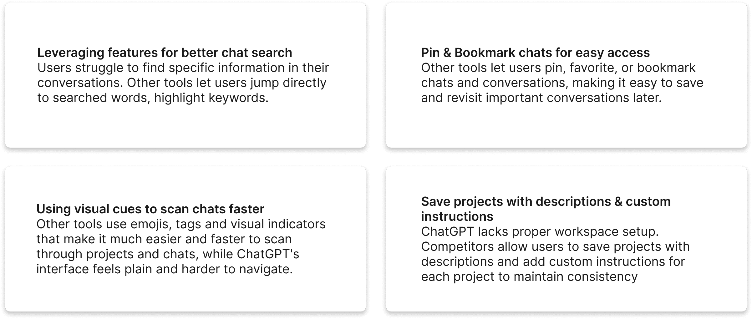
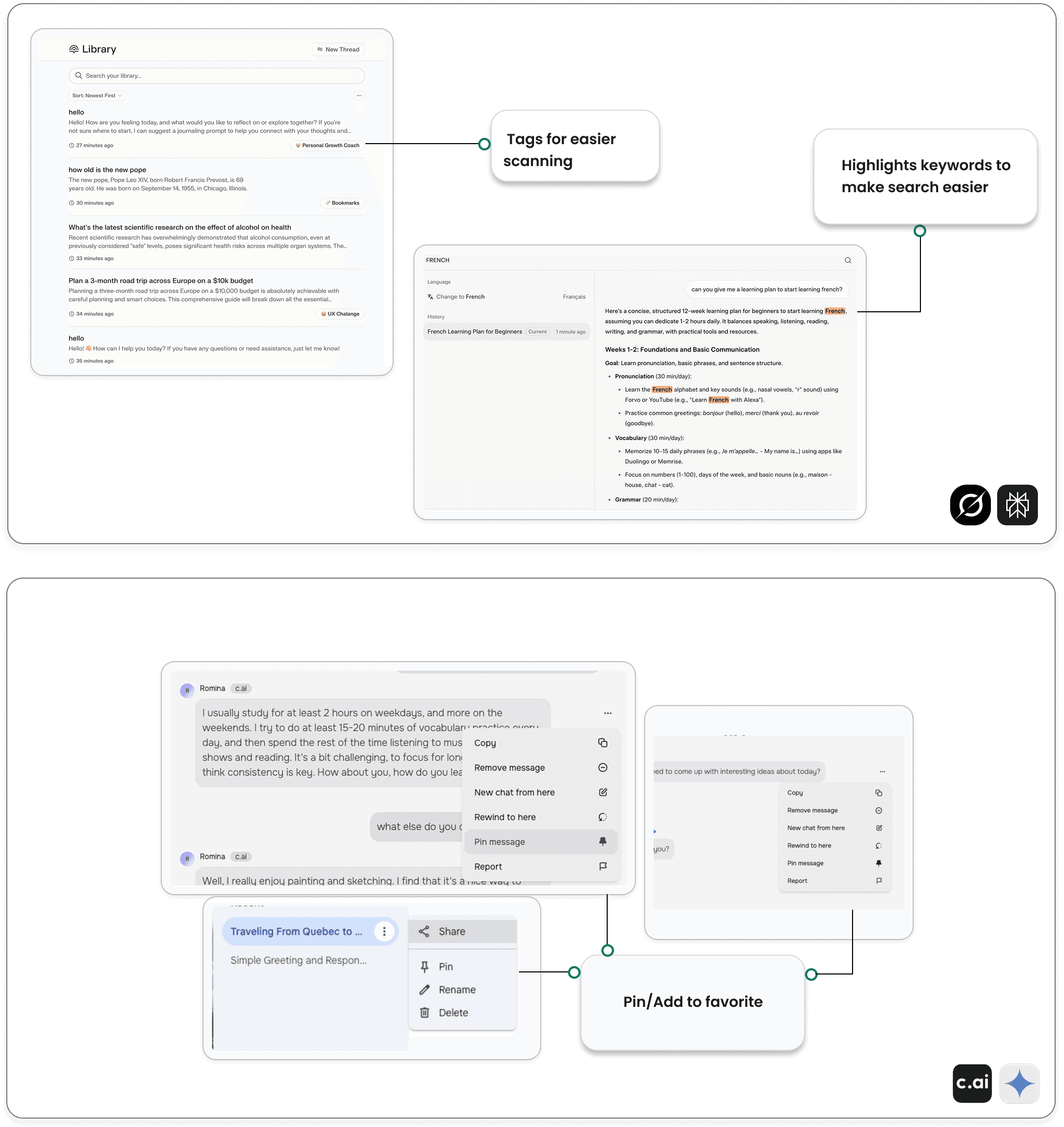
Competitive Analysis
What can we learn from our competitors?
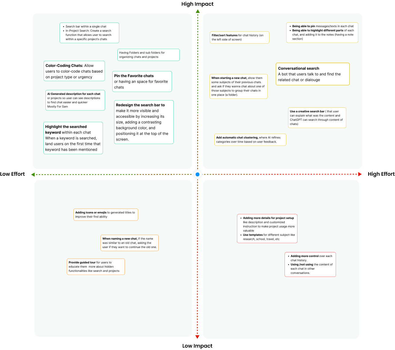
So what features are needed?
To decide what our design should include, we started by listing out feature ideas based on what we had learned about our users and their struggles. Then, we used a simple priority matrix to figure out which ones were the most useful and realistic to build.
Design decisions
Let’s explore how we turned ideas into design.
We used a clean, modern interface with clear visual hierarchy and subtle color cues to reflect organization and ease of use. The design aimed to reduce clutter and align with ChatGPT’s branding for a seamless, intuitive experience.
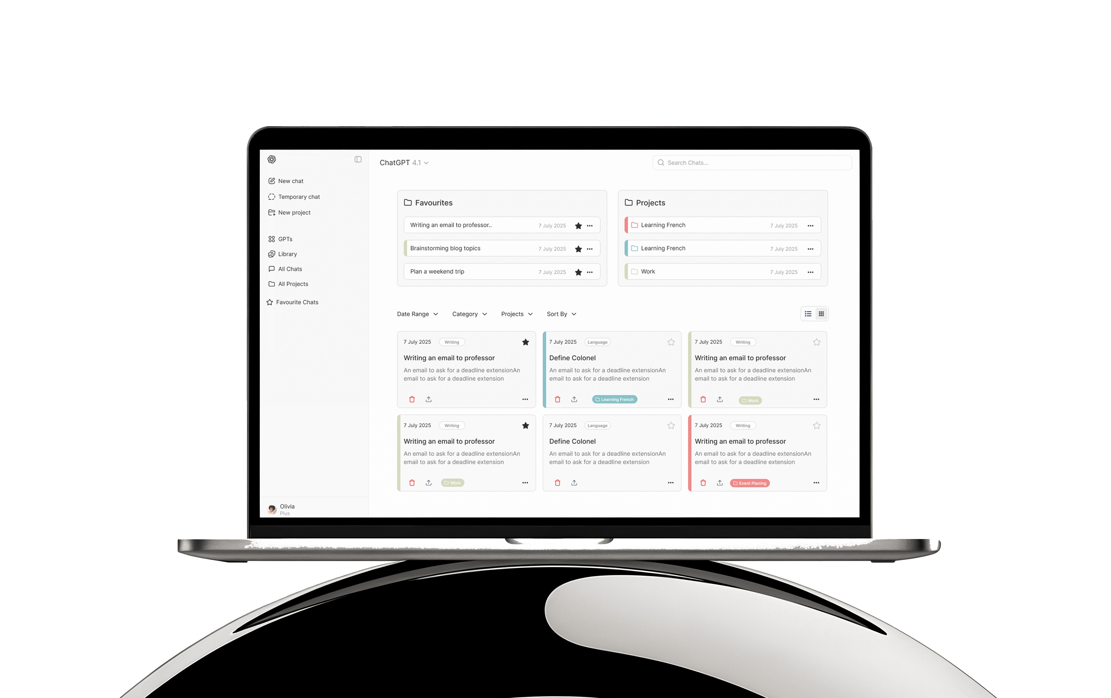
Improving The Visibility Of Features At Home Page
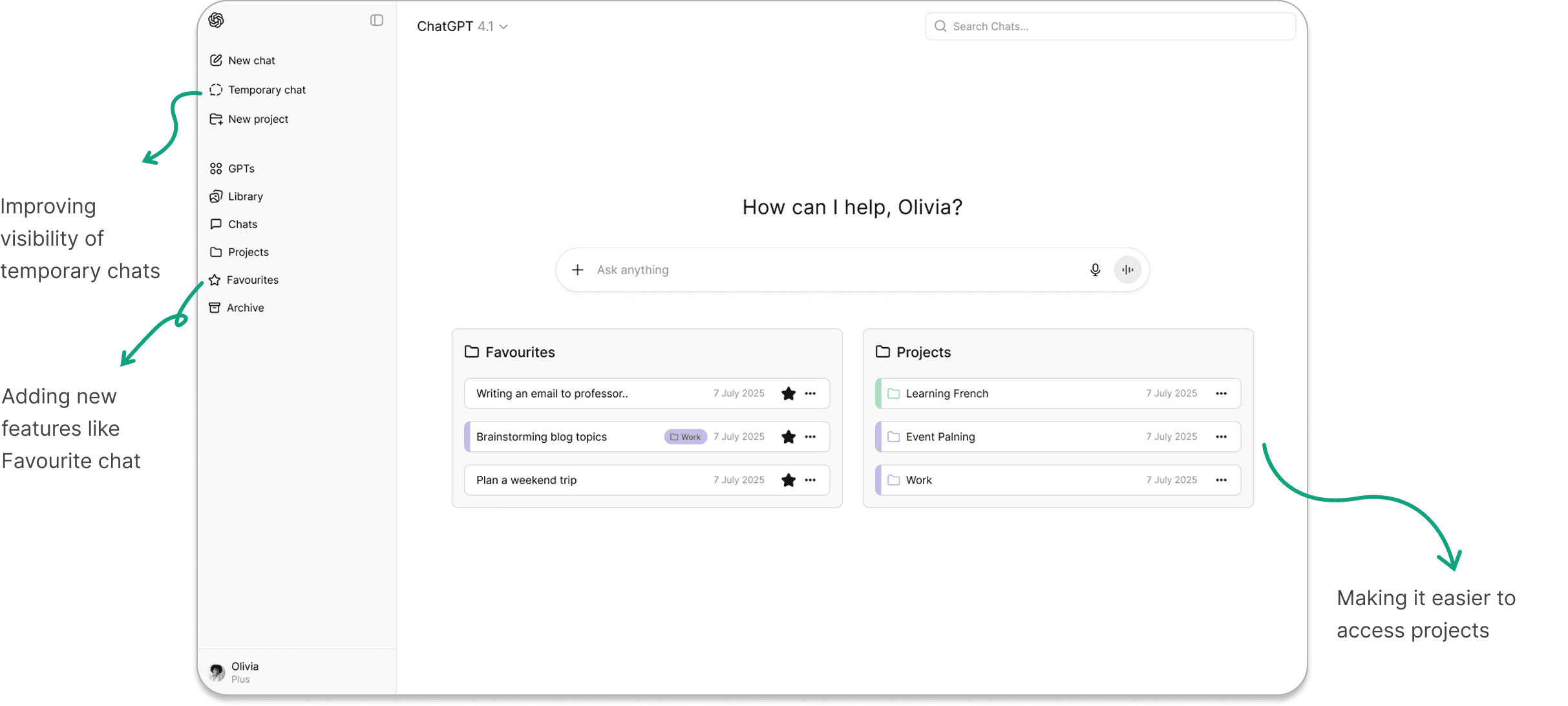
See different frames of All Chats
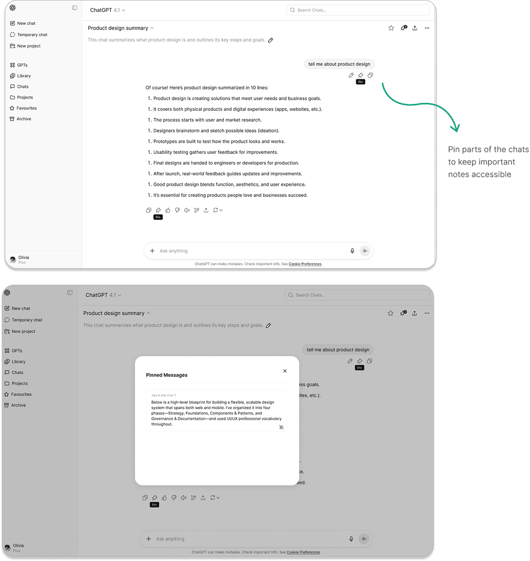
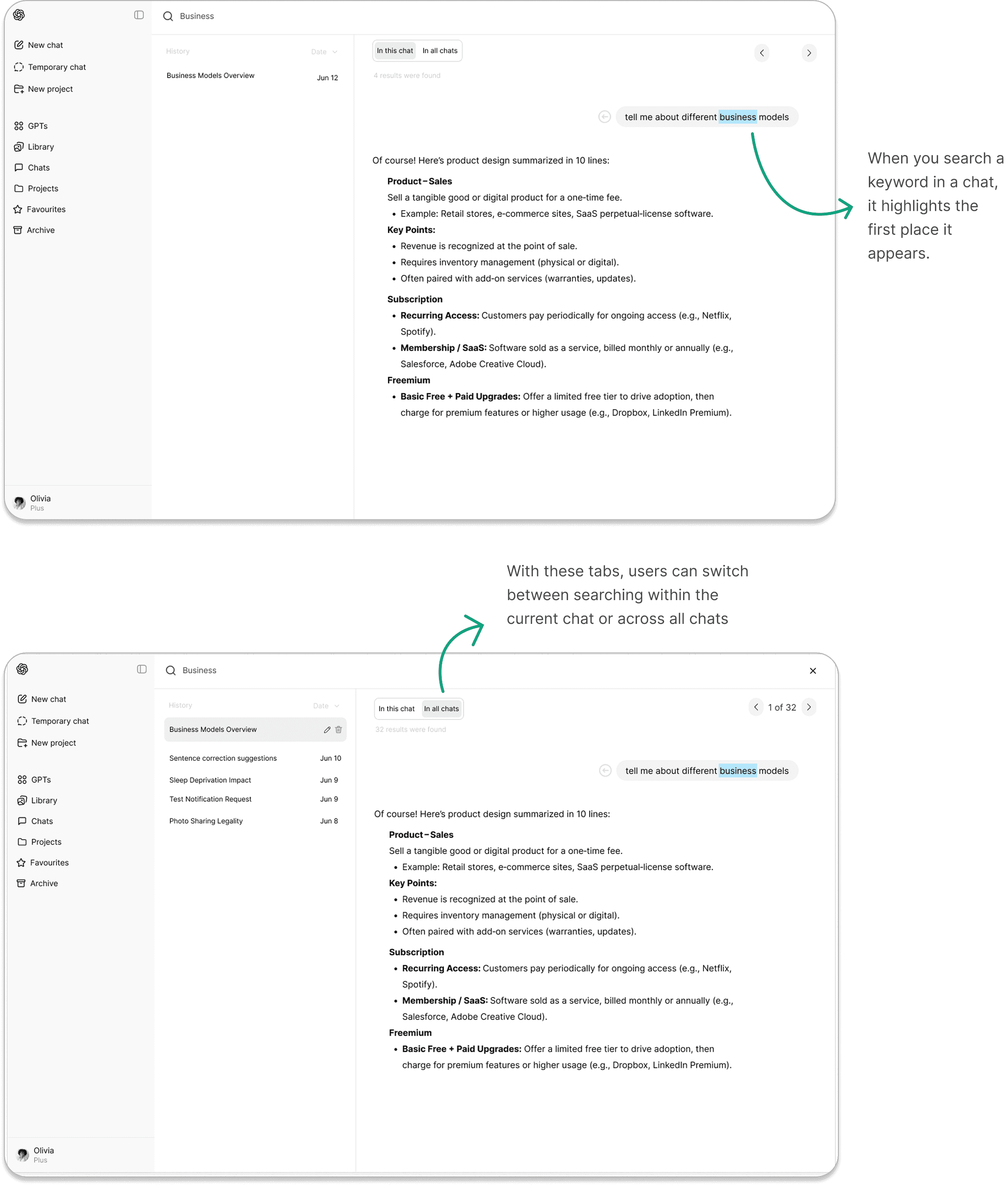
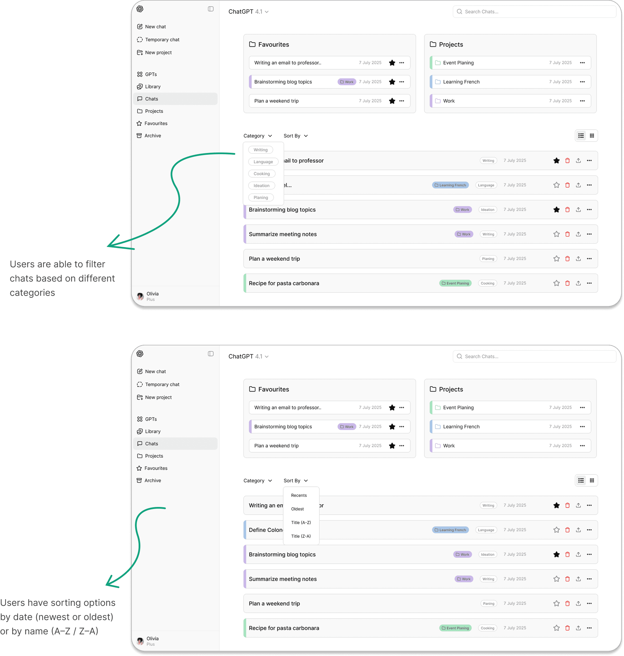
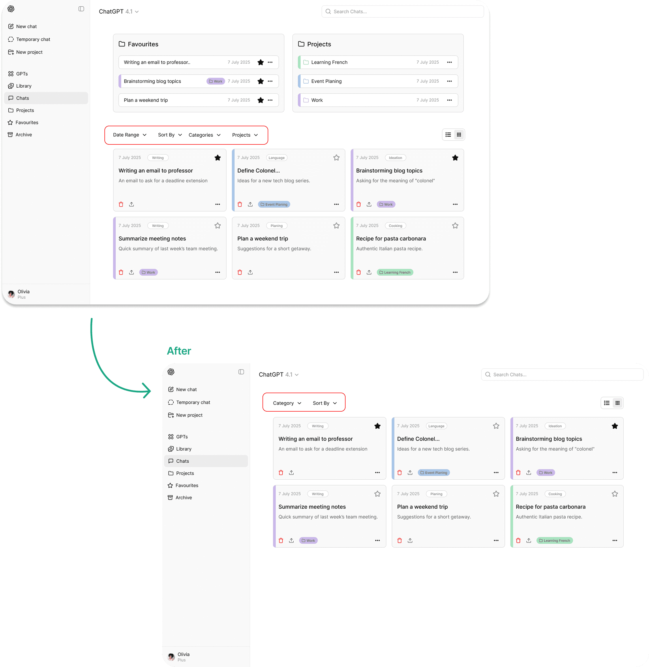
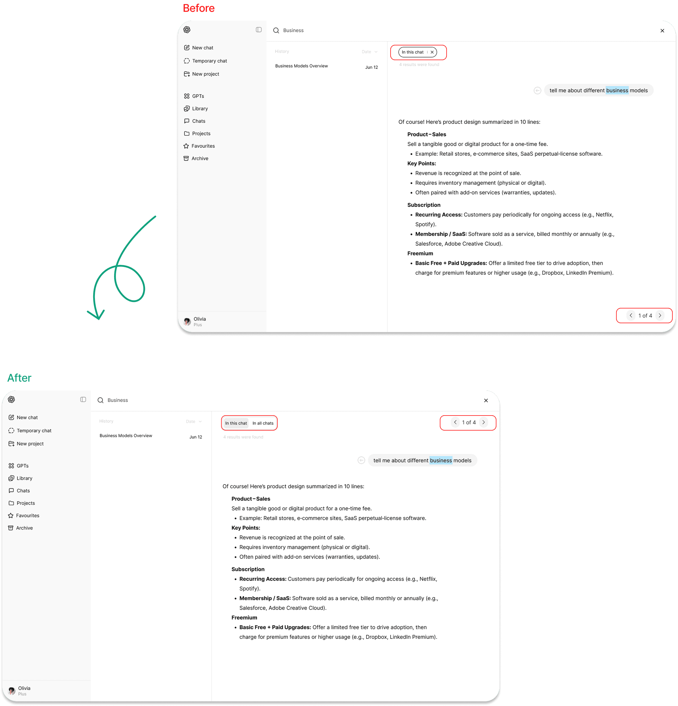
To improve user engagement and navigation, we introduced features like smart categorization, improved search placement, project highlighting, favorite feature, multiple view options, and advanced sort and filter tools.
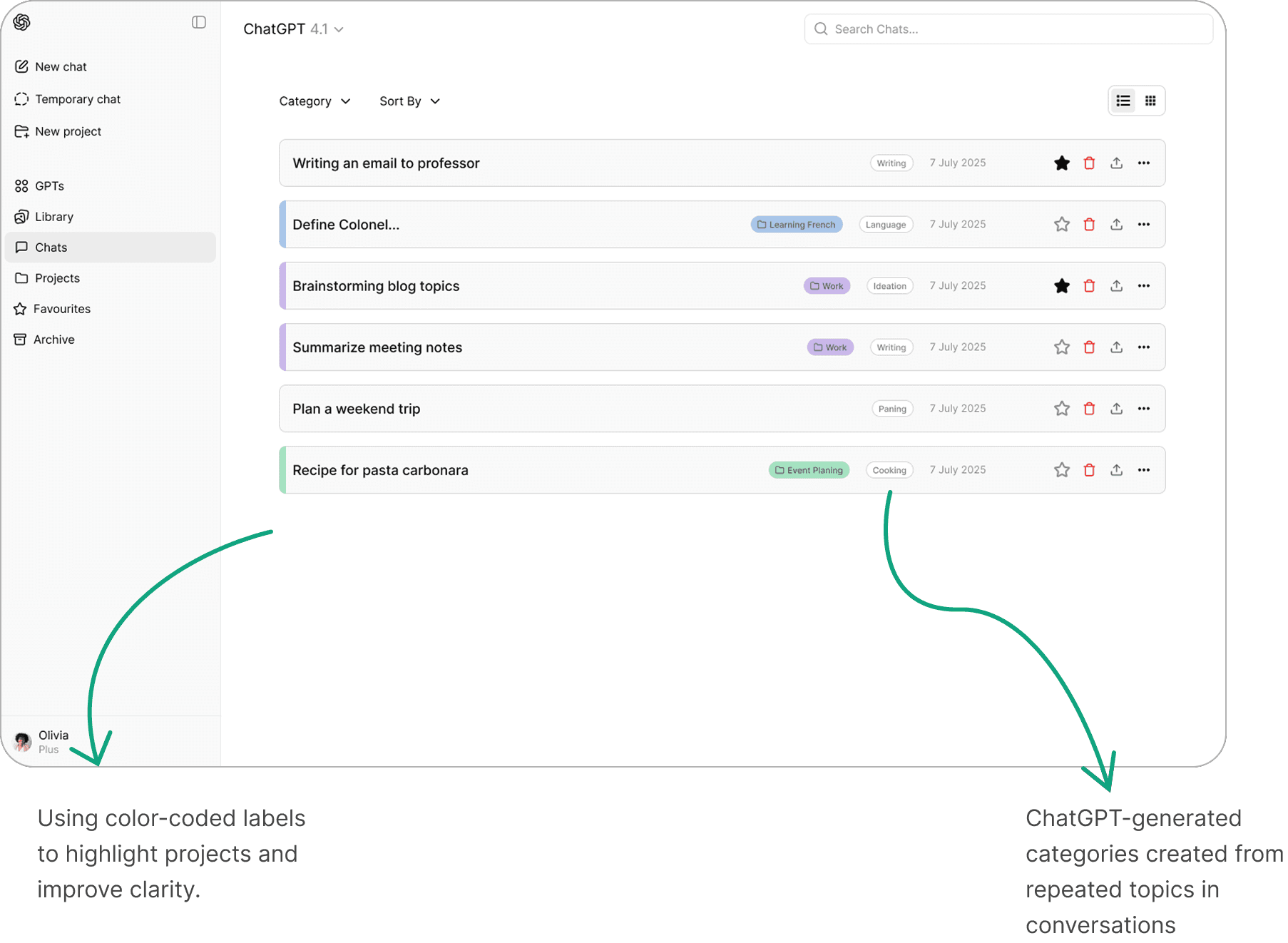
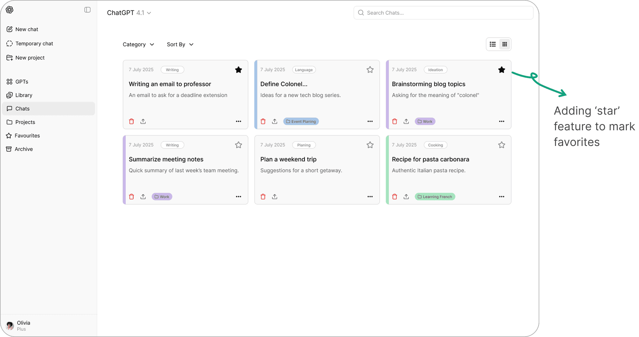
Pin the chats
Search within chat vs. search in all chats
Searching By Categories and Sorts
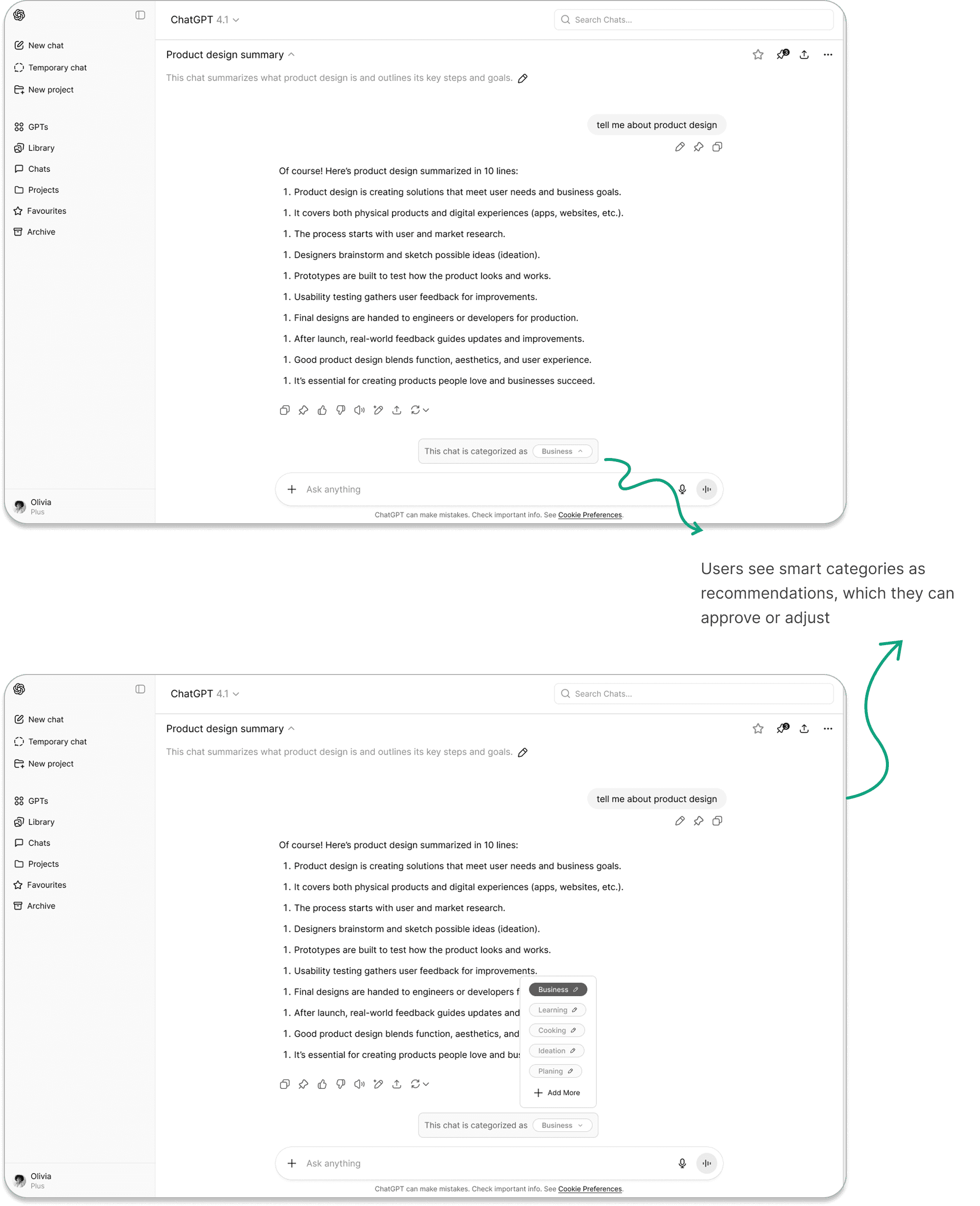
Approving or Modifying Smart Categories
Testing
Real Users, Real Improvements
Before finalizing the design, we returned to users with prototypes, conducted testing sessions to surface pain points, and used their feedback to iteratively refine our solutions — ensuring the final product was more intuitive, efficient, and aligned with real needs.
Here are too many filters — it's overwhelming
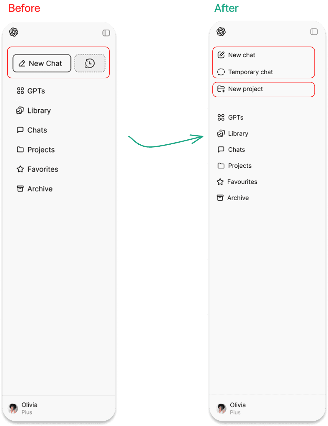
Why are New Chat and Temporary Chat at the same level?
A user after seeing the first version of our design mentioned: I don’t like seeing the New Chat and Temporary Chat buttons at the same level. And “I want a ‘New Project’ button in the sidebar so it’s easier to start.”
I can’t tell where I am, and once I close it I’m stuck.
Users couldn’t tell their position or return after closing — fixed by surfacing numbers up top and enabling easy back navigation. Also pagination moved to the top for better visibility based on what users expected.
Takeaways
Through this project, we learned the importance of balancing different user needs when designing for a tool as broad as ChatGPT. Regular users working on multiple projects value structure, organization, and quick ways to retrieve past insights, while casual users prefer simplicity and a clean interface. This contrast showed us that design isn’t about solving a single problem, but about recognizing diverse workflows and creating solutions flexible enough to support them. We also saw how small usability gaps, such as a hidden search bar or unclear project features, can leave users feeling lost or force them to repurpose features in unintended ways. Ultimately, we learned that effective design means making features intuitive and shaping ChatGPT into a workspace that adapts to every type of user